What is it about hockey jerseys that makes fans wear them with such pride? For over a century, the jerseys worn by NHL players have carried more than just team logos—they represent the identity, history, and passion of both the teams and their supporters.
NHL jersey history is a rich tapestry woven with stories of innovation, tradition, and artistic expression, reflecting changes in fashion, technology, and the game’s commercial evolution.
NHL Jersey History: From Classic to Modern
This article will walk you through the transformation of NHL jerseys from their humble beginnings to the modern-day designs that have become iconic symbols of the sport.
The Early Days of NHL Jerseys
When the NHL was founded in 1917, the league’s first jerseys were designed with simplicity in mind. Early uniforms were primarily functional, made of heavy wool to keep players warm on the ice.
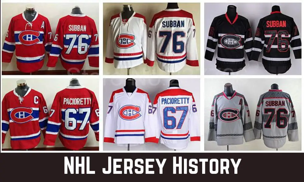
Team logos were either sewn or embroidered, often featuring simple designs like stripes or crests. The Montreal Canadiens, one of the oldest teams, set a trend with their red, white, and blue jersey design, which remains largely unchanged today.
The original NHL teams, such as the Canadiens, Toronto Arenas (now Maple Leafs), and Ottawa Senators, all had jerseys that featured unique color schemes, largely inspired by local culture or existing team affiliations.
There were no rules regarding player numbers or names on the jerseys at the time. Back then, the focus was purely on distinguishing teams during gameplay and ensuring that players stayed warm in the cold arenas of the era.
Evolution of Materials
As the NHL grew, so did advancements in jersey technology. The early wool jerseys, while effective at providing warmth, were heavy and absorbed sweat and water, which made them uncomfortable as games wore on.
In the mid-20th century, the league began shifting towards lighter materials like cotton and rayon, which were easier to wear and didn’t weigh players down as much. By the 1980s, synthetic fabrics such as polyester became the standard, thanks to their durability, flexibility, and ability to wick moisture away from the body.
Modern jerseys now incorporate cutting-edge materials that enhance player performance. Companies like Reebok and Adidas have developed fabrics designed to increase mobility, reduce drag, and keep players cooler during games.
This evolution of materials has not only improved player comfort but also opened new possibilities for more complex and dynamic jersey designs.
Design Trends in the 1920s–1940s
The designs of NHL jerseys during the 1920s to 1940s were relatively simple compared to today’s standards, but they laid the foundation for many of the iconic looks we recognize now. Stripes were a popular design element, often running horizontally across the chest, sleeves, or socks, helping teams stand out from each other.
Logos were also beginning to take center stage, with many teams opting for bold, easily recognizable symbols that could be seen from afar. For example, the Boston Bruins introduced their famous bear logo in the 1940s, and the Chicago Blackhawks adopted a version of their Native American head logo during this era.
Colors were another area where teams could express their identity. The Detroit Red Wings, for instance, adopted their signature red jerseys early on, while the Toronto Maple Leafs moved toward their iconic blue-and-white palette.
These design decisions became key elements of team branding, creating visual connections between the club and its fanbase.
The Original Six and Their Iconic Jerseys
The NHL’s “Original Six” teams—Boston Bruins, Chicago Blackhawks, Detroit Red Wings, Montreal Canadiens, New York Rangers, and Toronto Maple Leafs—are still considered the standard-bearers of hockey tradition. Their jerseys have become legendary, with many of the designs still in use today, only with minor alterations.
The Canadiens’ red jersey with a white-and-blue stripe across the chest remains one of the most recognizable uniforms in sports. Similarly, the Red Wings’ red-and-white jerseys have changed little since their introduction in the 1930s. The simplicity and consistency of these designs have helped them remain timeless.
The Blackhawks’ jersey, featuring the Native American chief logo, became a cultural icon, though it has been the subject of debate in recent years due to its depiction of Indigenous imagery.
Meanwhile, the Rangers’ diagonal “New York” script on their jerseys, a design choice from the 1920s, continues to be a hallmark of the franchise’s identity.
These six teams and their iconic jerseys have become synonymous with NHL heritage, representing both the tradition and evolution of the game.
The Influence of Television on Jersey Design
The rise of televised NHL games in the 1950s and 1960s had a significant impact on jersey design. With fans now watching games from their living rooms rather than just the stands, teams needed to ensure that their jerseys were visually distinct and recognizable on black-and-white televisions.
This led to bolder color choices and larger logos that could be seen more clearly on screen. Teams like the Detroit Red Wings and Montreal Canadiens, whose vibrant red jerseys stood out even in grainy broadcasts, benefitted from this era.
Television also influenced the league’s decisions about how jerseys should contrast. Home teams started wearing dark jerseys while visiting teams wore white, a standard that persisted for decades.
This contrast made it easier for viewers to differentiate between the two teams, especially in fast-paced games where movement is constant.
As the technology improved, jersey designs continued to evolve to meet the demands of a growing TV audience, with color contrasts becoming even more important in the age of high-definition broadcasts.
Jersey Numbering and Player Identification
While today it’s hard to imagine a hockey jersey without numbers and names, this wasn’t always the case. In the NHL’s early years, players did not wear numbers, and the practice only became standard in the 1930s.
The introduction of jersey numbers made it easier for fans, referees, and commentators to identify players during games. As the league grew and television broadcasting became more widespread, adding player names to the back of jerseys became the next logical step.
In the 1970s, names were introduced, beginning with the Philadelphia Flyers as the first team to experiment with this concept during the playoffs. By the 1980s, the NHL mandated that all teams must include both names and numbers on the jerseys to further help with player identification, especially for fans watching on TV. This practice has since become an integral part of the NHL jersey design and has allowed for greater player recognition and fan engagement.
Expansion Era Jerseys (1967–1980s)
In 1967, the NHL doubled in size with the expansion from the Original Six to 12 teams, marking the beginning of a new era in both the league and its jersey designs. The new teams—such as the Los Angeles Kings, St. Louis Blues, and Pittsburgh Penguins—introduced fresh colors and logos, breaking away from the more traditional styles of the Original Six. The Kings, for instance, donned purple and gold jerseys, a bold departure from the conservative color schemes seen up until then.
The 1970s and 1980s saw more expansion and, with it, even more experimentation in jersey design. Teams like the Vancouver Canucks introduced jerseys with vibrant color palettes, including the iconic “flying V” design that polarized fans and critics alike. The Canucks’ uniforms during this era reflected a willingness to push boundaries, using geometric shapes and bold contrasts that stood out from the traditional jerseys of the league’s early decades.
The emergence of teams in non-traditional hockey markets, like the California Golden Seals, led to further experimentation. The Seals, for example, tried everything from green-and-yellow color schemes to white skates, as teams in warmer climates worked to establish a unique identity separate from the colder, northern hockey hubs.
Introduction of Alternate Jerseys
In the 1990s, the concept of alternate jerseys gained popularity as a way for teams to expand their branding and give fans more options for expressing their support. The third jersey program allowed teams to create special jerseys, often with designs that were edgier or tied to their heritage.
This trend quickly became a fan favorite, with teams like the Anaheim Mighty Ducks debuting a third jersey featuring the iconic duck mask logo in bold purple and teal.
Teams used alternate jerseys as an opportunity to experiment with new designs, colors, and logos that wouldn’t necessarily work on a regular home or away jersey. Some teams went with retro-inspired looks, while others embraced futuristic or daring designs that departed from their usual branding.
The introduction of alternate jerseys also allowed for increased merchandise sales, as fans flocked to buy limited-edition designs.
The 1990s: Bold New Designs
The 1990s was a decade defined by bold and often controversial design choices in the NHL. This period saw teams move away from the more conservative, traditional styles of the past and embrace unique, attention-grabbing looks.
Some of the most notable designs came from expansion teams like the San Jose Sharks, whose teal and black jerseys became an instant hit.
Meanwhile, the Phoenix Coyotes introduced a southwestern motif with their desert-inspired colors and kachina logo, making their jerseys among the most distinctive in the league.
Even older franchises experimented during this era. The New York Islanders, for example, introduced the infamous “fisherman” jersey in the mid-1990s, which featured a cartoonish logo of a fisherman holding a hockey stick.
Though widely criticized at the time, it has since gained a cult following among fans. This era of experimentation marked a shift toward jerseys becoming more than just sportswear—they became works of art, each telling a story about a team’s identity and the city it represented.
Reebok and the Edge System (2007)
In 2007, Reebok revolutionized the NHL jersey landscape with the introduction of the “Edge System.” This new line of jerseys aimed to enhance player performance through improved fit, breathability, and moisture-wicking technology.
Reebok’s Edge jerseys were made from lighter, more flexible materials that allowed for a greater range of motion, while also reducing drag on the ice. These innovations were designed to give players a competitive edge, making them faster and more comfortable during gameplay.
The Edge System also standardized jersey designs across the league, resulting in some uniformity, which fans and critics had mixed reactions to.
While the focus on performance was widely praised, some felt that the streamlined designs lacked the character and individuality that made earlier jerseys so distinctive.
Despite the debate, the Reebok Edge jerseys marked a significant step forward in the fusion of technology and sportswear, and they remained in use for a decade before Adidas took over as the league’s jersey provider in 2017.
Adidas Takes Over (2017)
When Adidas assumed the role of the NHL’s official jersey provider in 2017, the company sought to build on the innovations introduced by Reebok while also adding its flair.
Adidas introduced the “Adizero” jersey, which was lighter, stronger, and more breathable than its predecessor. These jerseys featured improved durability and reduced weight by about 19% compared to Reebok’s Edge system, giving players an even greater sense of agility on the ice.
Adidas also placed a renewed emphasis on the aesthetic aspect of jersey design, focusing on creating visually striking looks that appealed to both players and fans.
This was evident in their collaborations with teams to produce modern, sleek jersey designs that still paid homage to historical elements.
Teams like the Vegas Golden Knights, who joined the league in 2017, benefited from Adidas’ fresh approach, debuting jerseys with a distinctive gold, gray, and black color scheme that quickly became one of the league’s most popular.
Throwback and Retro Jerseys
In recent years, nostalgia has played a significant role in NHL jersey design. Many teams have embraced retro and throwback jerseys as a way to honor their heritage while tapping into the sentimental value these designs hold for fans.
The popularity of “Reverse Retro” jerseys, introduced by Adidas in 2020, highlights this trend. These jerseys took classic designs from each team’s past and reimagined them with modern color schemes and logos.
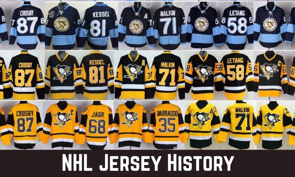
For example, the Colorado Avalanche paid tribute to the Quebec Nordiques by incorporating the Nordiques’ famous fleur-de-lis design into their jerseys, while the Pittsburgh Penguins revived their classic black-and-yellow diagonal “Pittsburgh” jersey from the 1990s.
Fans have responded enthusiastically to these throwbacks, as they connect with the rich history of the league and the personal memories tied to older designs.
NHL Winter Classic Jerseys
The NHL Winter Classic has become one of the league’s marquee events, and with it, the introduction of special jerseys that reflect the outdoor, old-school spirit of the games.
Each year, teams playing in the Winter Classic design unique jerseys that harken back to earlier eras of hockey, often featuring vintage-inspired logos, muted color palettes, and classic striping patterns.
For example, when the Chicago Blackhawks played the Detroit Red Wings in the 2009 Winter Classic, both teams wore throwback jerseys reminiscent of their uniforms from the 1930s.
These special jerseys often incorporate elements of the teams’ original looks, adding a layer of historical authenticity to the outdoor games and further connecting modern players with the roots of the sport.
The Winter Classic jerseys have become highly sought-after collector’s items, celebrated for their classic aesthetics and limited availability.
The Rise of Jersey Sponsorship
In recent years, the NHL has followed other professional sports leagues by allowing teams to place small sponsor logos on their jerseys.
This practice, which began in the 2021–22 season, introduced subtle advertising patches on player jerseys in league history.
Though initially met with resistance by some purists who feared that sponsorships would take away from the integrity of the jerseys, the move has generated valuable revenue for teams.
The logos are kept relatively small, often on the shoulder or chest area, ensuring that they don’t overwhelm the design or distract from the team’s branding.
As sponsorships become more commonplace, the NHL will likely continue to explore this avenue for generating income, especially as other major leagues like the NBA have already normalized the practice.
Customization Options for Fans
Another major development in NHL jersey history has been the rise of fan customization. Thanks to technological advancements and an increase in demand, fans today can personalize their jerseys with their favorite player’s name, and number, or even create completely custom designs.
Whether through team stores or online retailers, this trend has allowed fans to feel even more connected to their favorite teams and players.
Personalized jerseys have become a staple of fan culture, with many opting to customize jerseys with special milestones or anniversaries, such as championship years or iconic player retirements.
Teams have capitalized on this by offering customization as a premium service, allowing fans to create truly unique pieces of memorabilia.
Cultural and Regional Influences on Jersey Design
Jersey designs are often influenced by the culture and history of the city or region that a team represents. This is especially true for newer teams looking to establish their identity in a saturated market.
For instance, the Vegas Golden Knights used a color scheme of gold, gray, and black to reflect both the glitz of Las Vegas and the strength of a medieval knight.
Their jerseys also featured subtle details, like a star pattern representing Nevada’s state flag, showcasing the deep connection between the team and its local fanbase.
Similarly, the Arizona Coyotes have incorporated regional motifs into their jerseys, drawing from the Southwest’s rich Native American heritage and desert landscape.
The Coyotes’ kachina-style jerseys, originally introduced in the 1990s and later brought back as alternates, feature intricate patterns inspired by traditional southwestern art.
These cultural and regional influences help teams build a unique identity while connecting with local communities, deepening the emotional bond between fans and their teams.
The Future of NHL Jerseys
As technology and fan preferences continue to evolve, the future of NHL jerseys is full of possibilities. We may see further advancements in material technology, leading to even lighter, more durable jerseys that can improve player performance.
Additionally, the rise of digital and augmented reality experiences could allow fans to interact with jersey designs in new ways, such as customizable AR patches or interactive logos.
Sustainability may also play a role, with teams and manufacturers potentially looking for eco-friendly materials to produce jerseys. We could see a future where jerseys are not only performance-enhancing but also environmentally conscious, reflecting the broader movement toward sustainability in sportswear.
Conclusion
The history of NHL jerseys is a fascinating journey of evolution, from simple wool sweaters to high-tech performance wear. Jerseys have always been more than just uniforms; they are symbols of team pride, culture, and history.
As designs continue to change and adapt to new technologies and fan demands, one thing remains constant: the deep connection between the jerseys, the teams, and the fans who wear them.
The NHL’s rich heritage is woven into every stitch of its jerseys, making them an enduring part of the sport’s legacy.
FAQs
What was the first NHL team to wear jerseys with numbers?
The Toronto St. Patricks (now Maple Leafs) were one of the first teams to add numbers to their jerseys in the 1920s.
When did names start appearing on NHL jerseys?
Player names were first added to jerseys in the 1970s, becoming mandatory in the 1980s.
Why do some NHL teams wear throwback jerseys?
Throwback jerseys are used to honor a team’s history and connect with fans who have a nostalgic attachment to older designs.
What is the Reverse Retro program?
The Reverse Retro program, introduced by Adidas in 2020, reimagines classic team jerseys with modern twists on colors and design elements.
Are NHL jersey sponsorships common?
Yes, starting in the 2021–22 season, small sponsor logos have appeared on NHL jerseys, following trends from other sports leagues.
How has television influenced NHL jersey designs?
Television broadcasts, especially in the 1950s, led to bolder colors and clearer logos so viewers could easily distinguish teams.